Turning M9 color DNGs into monochrome DNGs
A series about the development of an experimental piece of software, called DNGMonochrome, able to convert color DNGs into monochrome DNGs...
The software is available
here.
Please note that this post is based on the very first version of DNGMonochrome... Quite a bit of changes and improvements were implemented in subsequent versions... if you want to get an updated view, select the label DNGMonochrome on the right (or at the bottom of this post) and read the more recent blog posts...
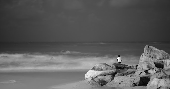 "Contemplating"
(a six seconds exposure at night at the beach, 50mm Summilux f/1.4 asph, ISO 200... the complete stranger on that rock sat still long enough...)
M9 color DNG turned red filtered monochrome DNG by DNGMonochrome.
(some additional post processing on this one)
Click on it for the 1280 pixel wide version. 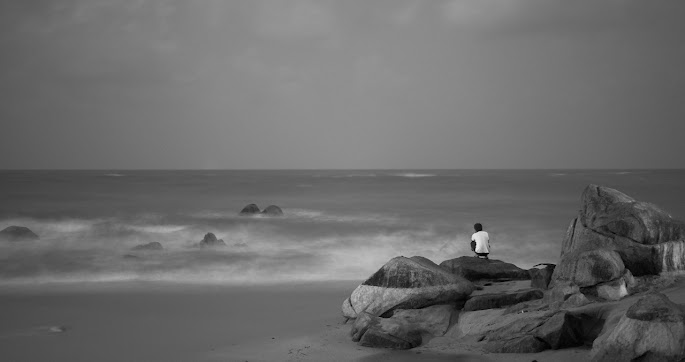 "Contemplating"
(a six seconds exposure at night at the beach, 50mm Summilux f/1.4 asph, ISO 200)
M9 color DNG turned blue filtered monochrome DNG by DNGMonochrome.
(some additional post processing on this one)
Because of the long exposure the sea becomes very fuzzy as opposed to the sharp rocks that don't move. The blue filter pulls the sky and the sea out, creating the strange illusion that the guy on the rocks is watching an out of focus movie (like the sea is projected onto a screen), or that the rocks and him were pasted on top of the photo... The red filtered one also creates that illusion, but less strong...
Click on it for the 1280 pixel wide version. 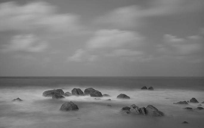 "Rocks"
(a 32 seconds exposure at night at the beach, 28mm Elmarit f/2.8 asph, ISO 200)
M9 color DNG turned blue filtered monochrome DNG by DNGMonochrome.
(some additional post processing on this one)
Click on it for the 1280 pixel wide version. 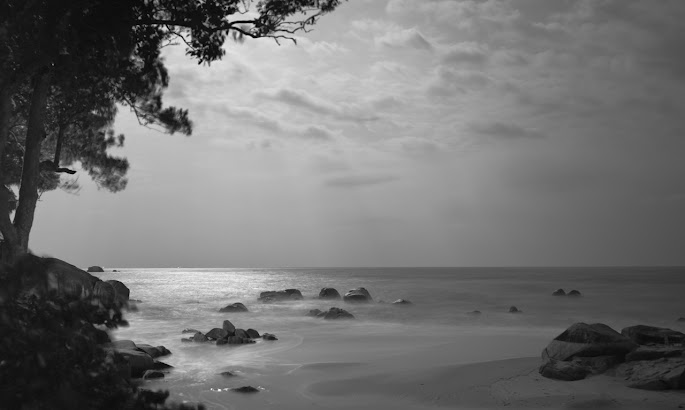 "Moonlit"
(an eight seconds exposure at night at the beach, 28mm Elmarit f/2.8 asph, ISO 500)
M9 color DNG turned blue filtered monochrome DNG by DNGMonochrome.
(some sharpening and noise reduction on this one)
Click on it for the 1280 pixel wide version. 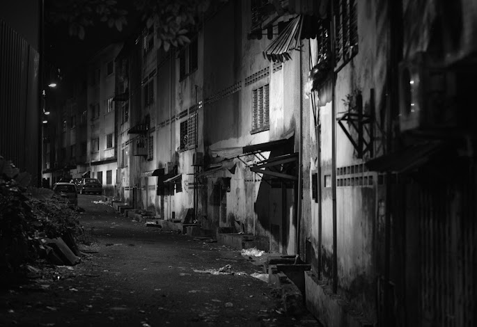 "Alley"
(1/30sec, Summilux 50mm f/1.4 asph, ISO 640)
M9 color DNG turned regular monochrome DNG by DNGMonochrome.
(no sharpening or noise reduction)
Click on it for the 1280 pixel wide version. 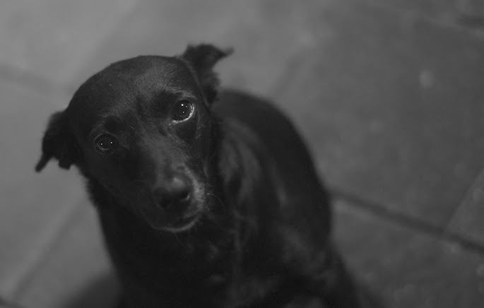 "Fatty Davis"
(1/15sec, Summilux 50mm f/1.4 asph, ISO 640)
M9 color DNG turned regular monochrome DNG by DNGMonochrome.
(sharpening and noise reduction applied, she really needed some TLC (and a cookie))...
Click on Fatty for the 1280 pixel wide version.
Creating a color photo out of a RAW file requires more processing than creating a monochrome photo out of the same RAW file.
The Idea (from part I)
If you turn a photo B&W in Lightroom, it's still based on the processed color photo. What happens if you use a lighter method to turn the RAW into monochrome? If you want monochrome, couldn't the interpolation be simpler, possibly leading to better results?
The Result
You be the judge after reading this series, looking at the photos and in the end - if you like - by trying the software.
The Method
I use the green values (the green filtered pixels on the sensor) or the red values (for a 'red filtered monochrome DNG') or the blue values (for a 'blue filtered monochrome DNG') to interpolate the photo. And to be able to do so, I implemented three algorithms, which I call Ratio I, Ratio II and Gradient (with 'Gradient' strongly based on the VNG algorithm, and Ratio I and II based on a more simple gradient principle with edge detection - all algorithms mixed with parts from ratio based approaches). I can also mix Ratio I or II with Gradient and use Gradient that way to prevent certain artifacts whilst retaining the sharper output.
I do not want to take credit for the algorithms, since the basic principles of the ones I use were thought up by other people... I just adapted.
Is this a new idea?
No... well, part of it isn't.
What isn't new about it is taking the luminance part of the color and using that to convert to black & white.
Several photo programs can do something like that by converting the RGB photo first to a different color model,
Lab for instance
(don't be discouraged if you don't understand one iota from what you read in that link, since that article was written by superNerd... he's known for his somewhat incoherent babble, bit like Heidegger... they speak great truths, but nobody knows it for sure...).
Then they use the L part of the Lab conversion to produce a monochrome photo
(the L in Lab stands for Lightness and that's not the same as Luminance in the luminance / chrominance model, but lightness is calculated based on luminance, so they are related... ask superNerd if you don't believe me, but make sure you have time enough for his answer...).
But the basis of such a method is the RGB color photo.
At some point early in the chain, there had to be color interpolation (even if it's a JPG straight out of your camera, it was color interpolated - in the camera).
Then there's all kinds of options in Photoshop, where you can twiddle with the RGB channels and easily filter out parts of the RGB image.
I'm skipping the RGB result completely - no full color interpolation, just a little bit of it - and go straight to the L(uminance) via the green pixel values, cutting all kinds of corners. And that's the biggest difference of course, because to achieve that - avoiding the RGB result - I had to implement my own algorithms.
That might be new, I don't know if other nerds out there tried this before iNerd (that's me) tried it.
All the consequences of this method, compared to all kinds of other methods out there, I also don't know, because I have tried only a few (mainly in Lightroom version 3.6).
I am just interested in creating a monochrome DNG, hoping to end up with cleaner and sharper results (so far so good).
You might be able to achieve similar results with other methods. But if the assumption is that you can get sharper results by making the interpolation simpler, avoiding the heavy duty color interpolation algorithms seems almost mandatory. My recently failed detour with DNGRender seems to support that theory: the algorithm that works fine for monochrome, produces quite some problems when applied to create a color photo. So if you attack those color problems by toughening up the algorithm - or by applying additional steps afterwards - there's also the risk that you start losing detail.
And about the L part of this method, theoretically speaking: I'm not sure if I am even allowed to call the green pixels 'the L(uminance) part'.
Walking the Line
The color police might fine me, because the green pixels are the L part in a color model, but I don't produce a color photo!
That might already be walking the line - on the border of the color law - seeing how I render the Bayer filter useless -
'in a Leica for god sake!' I can already hear them curse...
But me calling the green pixels the 'L' part and not producing color with it... that might be too much for some trigger happy color cop.
So I'm not sure what - or how - to call them when the green pixels are used outside a color model ('green pixels' actually sounds fine to me).
Possibly new
What is new about this (I think) is the DNG conversion.
I don't know of any software that performs this trickery on the RAW data (which doesn't mean it isn't already out there). Also, although I use the M9 DNG, I could have just as easily chosen a Canon CR2 raw file. The principle stays the same.
I realize that my choice to convert to DNG might be confusing to some, because TIFF seems more appropriate (although essentially DNG is more or less an extended version of TIFF), but I had the urge to keep it within the DNG, mainly because it's easier to program for.
I do not consider these converted DNGs 'RAW files' anymore... It's difficult to say what they are exactly. They contain linear data and all the values stay within the RAW boundaries - and at least one channel represents sensor output - but I think a true RAW file should represent the total sensor output. And that is something they don't do.
The One Issue
Now, the FBM (Federal Bureau of Monochrome) might fine me for a completely different reason, because this method has one issue: it's entirely unclear what the monochrome conversion is actually showing you (tonal range, spectral sensitivity... or in simpler terms: what level of 'gray' should a particular shade of e.g. yellow get, compared to say a particular shade of e.g. purple in the same scene...)
The algorithm can be improved, I can make sure the output is artifact free (give me a few months and a lot of free time) but this issue - if you feel it's an issue for you - can not be resolved.
Also, don't ask me about the specifics of this issue, since I don't know what the spectral sensitivity is of the luminance part of the M9 sensor.
I'm just a guy who had an idea.
I don't have black & white eyes, nor a brain that can convert what I see to black & white. I also don't have any black & white film experience. I think this stuff can all be found out, by running clever comparisons between black & white cameras, black & white film types, and this method.
But I also have a life (sort of).
Then again, one could simply argue: this is M9 black & white film. If you don't like it, load her up with Lightroom B&W film, and you have more (fuzzy) choice.
So not bothered, ignorant and not limited by burdens from the past - taunting the color police and the Federal Bureau of Monochrome - I just muddle on with this piece of software.
And when the software is finished (at least in a first version), you can be the judge of your own DNGs. I designed it for my own benefit foremost (like M9Tether), I don't mind sharing and I like writing about it. If you read this series in full, you can draw your own conclusions.
Of course, for people coming from black & white film, this issue can not be brushed aside that easily, and I fully understand if they object to this method on the grounds of it being too different from the film look they might be after.
Be aware
Be aware though, that if you do try DNGMonochrome you know what you're doing, because me not caring about the objections of the authorities, doesn't mean I don't care about the quality of the overall result.
At least browse through these posts to get an understanding of the method. There are downsides if you use the wrong combination of algorithms for the purpose of the photo.
This method also isn't suitable for every photo and if you do discover artifacts I didn't catch, there's nobody to help you out.
One of the bigger issues for instance I haven't solved yet (and might never solve) is moire.
Moire
Faulty sensor data (basically the detail not being caught by a red, green and blue filtered pixel, but only by e.g. a green filtered and a blue filtered pixel, leading to the wrong color - happens on slanted or diagonal lines that are too thin to cover the full three colors of the sensor pixels), causes what we call moire in the color scene and something entirely different in the monochrome scene. I know it's moire, because I see it in the original color version, but on first sight, in the monochrome version, I didn't recognize it as such. It has a different characteristic compared to the color version.
Some really fancy algorithms are able to deal better with the faulty sensor data and produce less moire. There's also algorithms around to deal with moire afterwards (sort of cleaning up after the fact - a moire Dustbuster), but implementing those properly takes a lot of time
(I haven't tried the 'moire' tool in Lightroom 4 yet, basically slipped my mind... kinda interesting to find out if it can tackle the monochrome 'moire'...)
Printing
I also don't know how these results will hold up in print. I don't print a lot and currently I don't even have a workable printer (they always break down on me). I wish that were different, because I'm very curious to find out how some of my results look on large prints.
This method needs to prove itself especially in large printing. In that sense all this requires more testing.
My own personal opinion
Am I gonna use DNGMonochrome?
For sure (and I already did, if you look at the examples), seeing that the increased resolution or sharpness and the lack of color noise seems a benefit.
Fatty Davis, shown in part VI, was one of the best examples.
It's also the only way for me to spot any shortcomings in the software.
Then again, I can hardly be called objective about this and I'm an amateur photographer... my demands or look at photos might be quite different from yours. So for what it's worth...
But I will keep testing, experimenting and I have a few more algorithms I'd like to give a try. Downside is that the more new stuff I implement, the more time consuming it becomes, because I have to compare all the results. My aim is to get to one algorithm, which can combine the current sharpness with less artifacts, to get rid of the mix overs. Next step will be to inspect the Gradient algorithm, to see if I can improve it for monochrome.
I don't convert many photos to B&W, because frankly I'm impressed by the Leica M9 color output and I like color, but I also like the possibility to have monochrome output, at least as an option to consider. Most of the examples shown at the beginning of this post I like better in color, but they were good photos to experiment with, especially to show what blue filtering can do.
Working with these DNGs I notice they are clean, tack sharp and seem to have a sort of 'quiet' quality I can not put properly into words. Perhaps it's the lack of underlying color, perhaps I'm not objective enough, perhaps... but who cares...
Use it if it suits you, don't use it if it doesn't.
If you do use it, feel free to contact me (preferably through the email on the download page) to let me know your results and if it works for you, especially if you decide to print some of your results really large.
Pros and Cons
Let me try to sum up the pros and cons, as objectively as possible:
positive
- sharper output
- cleaner output (no color noise)
- full blown monochrome DNG (fully editable in Lightroom and others)
- ability to go for full red or blue
negative
- spectral sensitivity is unclear (although it can be found out by comparing to other methods, other cameras and/or film, I can not change it if you don't like the current output)
- possible artifacts if you use the most dangerous settings
- possible artifacts I haven't spotted
- the method is untested in (large) printing
- you have to know what you're doing and get a bit of an understanding of the method
- you have to be careful with the results and inspect them more thoroughly than you might be used to, especially if you intend to go over a 100% in printing.
When can I try this?
In a few minutes, after you download and install it.
It is for PC / Windows, but if I get requests enough I might try to port it to OSX. Theoretically that should not be too difficult, but the user interface might be a little bit skinnier, since I'm foremost at home, as a programmer, in Windows.
The download page can be found
here.
---------------------------------------------------
And let's not forget...
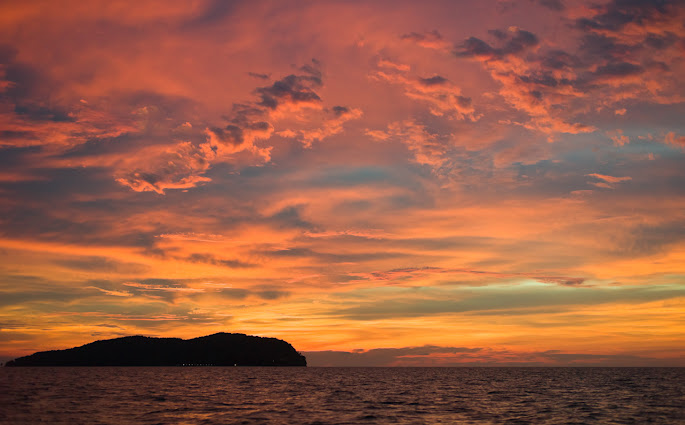 ...color is nice too...
Kota Kinabalu, Sabah, Borneo, Malaysia, 1 May 2012
Click on photo for the full version... DNGMonochrome had nothing to do with this one...
The inspiration that led to the name 'Fatty Davis' for the dog...
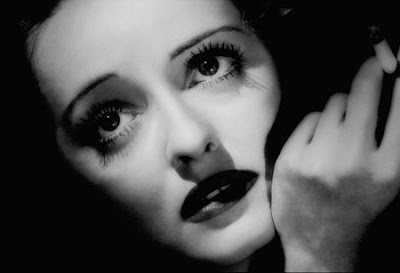 Stunning photo of Betty Davis...
Photographer unknown to me...
It was exactly this photo that leaped into my mind, leading to the name 'Fatty Davis' for the black (kinda fat) dog...
It's those eyes...
-------------------------------
"Stay on the road. Keep clear of the moors!" in part IV - line from 'An American Werewolf in London'
After seeing the results on this blog, Richard, from part VI, resigned from the color police and bought a Leica M9 so he can turn his color photos into monochrome.
The color police and the Federal Bureau of Monochrome do not really exist (I hope).
 Lightning over Malaysia, 8 December 2012


 Kota Kinabalu, Sabah, Borneo, Malaysia, 1 May 2012
  Kota Kinabalu, Sabah, Borneo, Malaysia, 1 May 2012
  Kota Kinabalu, Sabah, Borneo, Malaysia, 30 April 2012
  Fishing boat leaving the harbour...


 ...color is nice too...


