
...what's lurking in your DNG files that you haven't seen yet?
Turning M9 color DNGs into monochrome DNGs
A series about the development of an experimental piece of software, called DNGMonochrome, able to convert color DNGs into monochrome DNGs...
The software is available here.
Before we go on, let me first show you another example of a photo I was recently experimenting with. It was a difficult shot... at night, dark, a black dog that didn't want to stay put for very long... ISO 640, 1/15sec, not easy to focus but I think I managed on the shimmer in her eyes... I decided to turn the dog into black & white in Lightroom, so she was a good candidate for DNGMonochrome.
Meet Fatty Davis, street dog turned pet, actually a name we constructed after me producing the black & white photo, because she reminded me of a photo of Betty Davis...
(No offense to Betty Davis... Betty, you were awesome, loved your eyes!)
Here's both versions of the unprocessed photo, only cropped and with contrast/brightness adaptations to get the results as similar as possible. There's no big version of this one, so the results here are the uploaded sizes.

Fatty Davis done by Lightroom B&W...
No sharpening or noise reduction (color nor luminance)...
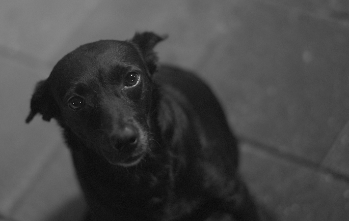
Fatty Davis done by DNGMonochrome...
No sharpening or noise reduction... note also the background and compare, especially the tiles on the right...
No sharpening or noise reductions on either one, and sharpening for the shown size is also not necessary, but noise reduction? Because especially when you start zooming in you discover that on the Lightroom version you really have to work a lot harder to get the results more acceptable... the color noise is detrimental...
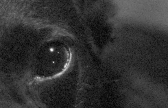
In The Eye of Fatty Davis, done by Lightroom B&W...
No sharpening or noise reduction... (where's the shine?)
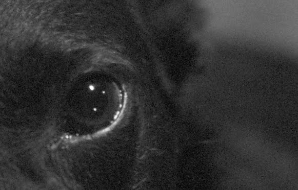
In The Eye of Fatty Davis, done by DNGMonochrome...
No sharpening or noise reduction... (oh, there it is...)
And yes, of course you can get rid of that color noise. Desaturating might actually help out here (didn't try that). But look at the bigger photos: there is hardly a difference to be had by Lightroom's color mixing, because this is the result I was going for. A black dog, in the dark night, on gray tiles... the color photo was already pretty monochrome.
The colors (and the color noise) are absolutely useless. And in such a case I want to get rid of them completely, and not by damaging detail with a slider.
I would then much rather start with the sharper monochrome result, and without the mush and color crud.
Besides, on this particular photo, Lightroom lost, because even with toned down color noise, sharpening and other adaptations, DNGMonochrome produced the nicest sharpest result, with less effort, and it fully preserved those shiny eyes, which is what this photo is about.
That said, and that being true for this photo: that doesn't mean it's true for all the other photos out there (we all know it's not, because most photos are not about black dogs named Fatty Davis...).
My point is that DNGMonochrome shouldn't be considered a replacement, but a very handy tool for photos that can use it. And this was one of those photos that perfectly illustrates my point.
The Girls from part V


Summilux 50mm f/1.4 asph, ISO 160... shot with the sun behind the kids and me not professional enough to properly expose for their faces, led to a photo I had to push a bit (raised exposure and blown highlights in the sky)... the photo is slightly cropped... no sharpening and no noise reduction... the shown size (320 pixels here) is not the uploaded size... click on either one for a 1280 pixels version... stick to the 'full' version... the other sizes are automatically down scaled and do not reflect the true output...
M9 color DNG turned into two different monochrome DNGs with DNGMonochrome and the Ratio II algorithm...
M9 color DNG turned into two different monochrome DNGs with DNGMonochrome and the Ratio II algorithm...
So what's happening with these girls?
Yes indeed... sitting there with my Bayer filter and after getting a bit tired of those green pixel values, I thought 'what a waste... such a nice color sensor and it's all gone...'.
So I decided it would be fun to try the same trick on the red pixel values, more or less creating a monochrome photo with a strong virtual red filter on the lens.
The effect is that areas with a lot of red get lighter, areas with less red get darker.
The left result is the regular monochrome DNG and the right result is the 'red filtered' monochrome DNG.
I have to warn you though, this part in the software is truly experimental, because at first I wasn't thrilled about the quality of the results.
The quality problem arises from the fact that on a Bayer filter you have 50% of green, but only 25% of red.
There's less solid information to start with, but the bigger problem is that the area of 'guessing' is extended (from 50% to 75%), which increases the margin of error.
Idea Number Seven
I then tried a multitude of ideas to improve the quality, and with Idea Number Seven, after a week of fruitless attempts, I finally had some success, confirmed by the MSE calculation.
It's a slow procedure (takes about 2 or 3 minutes per photo on a fast computer) but it does lift the quality of the red interpolated result, more towards the quality of the regular monochrome result.
However, the red interpolation really needs the best combination of algorithms (Ratio II mixed with Gradient or the full Gradient). If you start with Ratio I you can quickly discover defects when zooming in to about 300%.
It's simply not as solid as the result based on the green values and the red interpolation produces slightly more noise.
Blooper
This is from one of the ideas I had, a test run. It was Idea Number Five, which took a gross 45 minutes to calculate. Not wanting to wait for a test result on the whole photo I just ran a part of it... The dark band is the red filtered part in the otherwise regular monochrome photo. As you can see, when put like this, it really resembles a filter, like something was put in front of the lens.
I was interested mainly in my test subject's face and in the shopping bags carried by the out of focus persons on the right, since those are bright orange in the original color version. They made for a nice reference point to see if they would lighten up (that they did... Idea Number Five didn't totally suck and it resembles Idea Number Seven, which is a lot faster...).
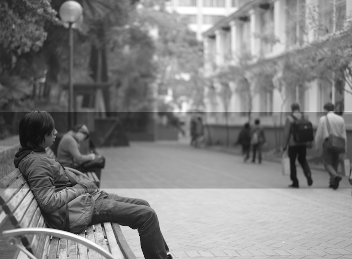
Blooper... test run of Idea Number Five that took too long per photo, so I only ran parts of it to see what the results would be... The darker band is the red filtered part in an otherwise regular monochrome photo... Idea Number Five didn't make it...
And what about blue?
Yes of course, that one too. I haven't shown you that one, but based on the same method as the red filter, DNGMonochrome can also produce a blue filtered version. In fact I'm also investigating orange and yellow filters. But because I'm still not color interpolating these colors are more difficult. Red and blue are relatively easy, because they exist as such within the sensor values. For orange or yellow that's a different story. Although orange might be achieved by cleverly mixing the regular and red result, I haven't tried that, because essentially that's color interpolating (now that would be some detour). It might introduce color noise and spoil the clean results so far... My current 'orange' approach works differently but is still flawed. Other options than red and blue won't be in the software until I'm sure I can make them work without losing too much quality.
We were already pretty sick of this whole endeavor, but now you're also downgrading the sensor! (Richard - desk officer at the color police...)
Now, at this point, some not so clever desk officers at the color police might start claiming that by using this method you are effectively reducing the sensor to 4.5 mega pixels (as opposed to the 18 mega pixels the sensor carries), because there is only 25% of red on the sensor (25% of 18 million is 4.5 million). Essentially it would be the same as claiming that the luminance interpolated photo is downgrading the sensor to 9 mega pixels.
Don't let them talk you into this, because it's not true.
Although the red on the sensor is only 25%, the interpolation algorithm actively uses the green and blue values to determine the outcome of the pixel under consideration. Without the green and blue values, the algorithm is lost. It needs those values to determine where (and how) to look for the proper value for the pixel being interpolated.
It means that the 75% of the sensor not carrying red, is still extremely useful and necessary to get to a good outcome.
If you would fill the sensor with zeros for the green and blue values, then it would be true, but then your photo would look pretty ugly. Like an up-scaled version of a photo from a 4.5mp sensor. You would be filling the gaps with information only based on the red values and that's not how the algorithms work.
Claiming that this method is downgrading the sensor (in any way shape or form) is false.
The sensor is utilized the full 100%, no matter if you interpolate based on the green values, based on the red values or based on the blue values.
Richard of the color police can only claim that the end result will be less good (quality wise) compared to starting with 50% green pixel values (and assuming the same algorithm is used for both versions).
And the red and blue result is indeed less good, even with my extended method. It's simply impossible (I think) to get to the same quality as starting with 50% green. No matter how smart the algorithm, you have to extend the area in which you are averaging, so you increase the margin of error. At some point at some magnification - if you compare it to the result that started from a solid 50% - that will show.
Fun
I must say, this has been fun for me personally.
I don't have any 'filter' experience, so seeing what purely red does to a photo is interesting. Especially human skin is influenced a lot. It gets whiter, turns shiny, almost glowing, imperfections are eradicated.
At first I thought it was the algorithm being fuzzy, but close inspection (especially when I ran the similar blue result, which has an almost opposite effect) revealed that's not the case. This is the strange 'glowy' effect the virtual red filter has on skin. Not too surprising of course, seeing that blood runs through it (I was also wondering if the 'glowing' effect might have something to do with infrared, but that's very much out of my league... I know the M9 has a filter to block infrared, but I don't know how strong that is - so I might be totally off base here).
See the next two photos, normal monochrome and red filtered monochrome. They're almost two different persons (these are test photos people... looking at the red filtered result I'm not sure if you should try this with any of your subjects if you know them well... I asked and graciously got permission from the person you're seeing here, to use his image and these results in this experiment... he's less dangerous than he looks here, but sometimes it's wise to make sure anyway...).
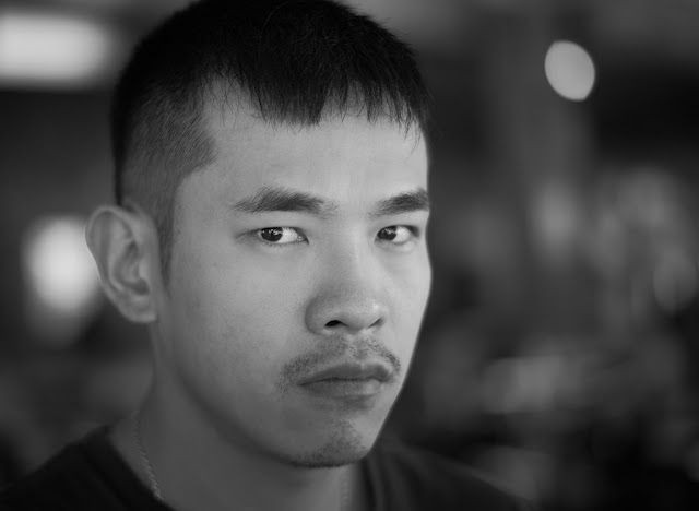
'Are you looking at me?'
M9 color DNG turned regular monochrome with DNGMonochrome... no sharpening or noise reduction...
The shown size here (640 pixels wide) is not the uploaded size. Click on the photo for the full 1280 pixel wide version...
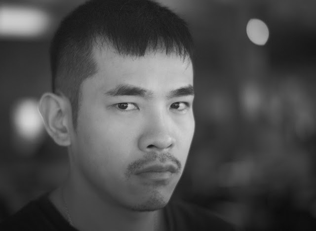
'Are you still looking at me?'
M9 color DNG turned red filtered monochrome with DNGMonochrome... no sharpening or noise reduction...
The shown size here (640 pixels wide) is not the uploaded size. Click on the photo for the full 1280 pixel wide version...
This was the Summilux 50mm asph wide open, hence only one eye is in focus... me practicing my focusing skills... no sharpening or noise reduction on either one, but I might have turned on the 'smart median filter' on the red result, and used Ratio II with a Gradient mix... I also put some more effort in the post processing of these DNGs... remember that I too am new at dealing with monochrome DNGs... it does take some getting used to, because although there's no color, you still have a lot of options to change the appearance of the photo...
Notice that the ISO was 640 on this one. On the regular monochrome (no noise reduction applied) you really can't tell. I only checked ISO after I saw the red result, which is more noisy (especially visible in the background).
Downsides?
Yes, that too... obviously the quality is slightly less compared to the luminance interpolated result, I already discussed that. It shows especially on 'busy' photos with a lot of detail, like in the next example. I also think this method is only suitable for some photos. Unless you're after special effects, using this on people like I did here might cause some aggression.
The effect - as you can see - is not very subtle and without too much effort you can turn your subjects into waxy ghosts.
For landscapes you might be happy with it though.
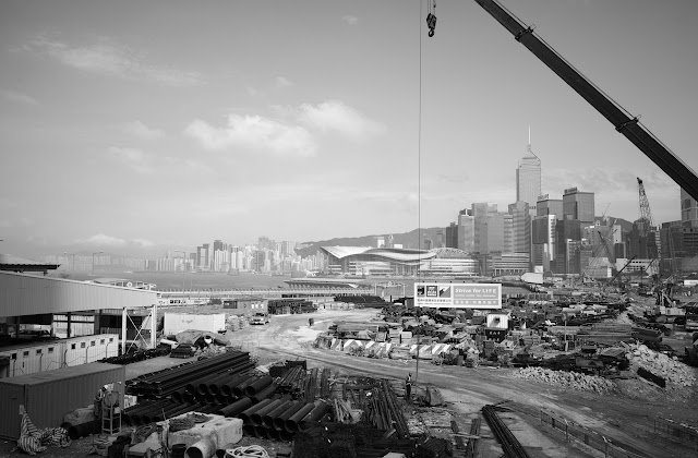
Hong Kong skyline shot over a building site...
M9 color DNG turned regular monochrome with DNGMonochrome... no sharpening or noise reduction...
The shown size here (640 pixels wide) is not the uploaded size. Click on the photo for the full 1280 pixel wide version...
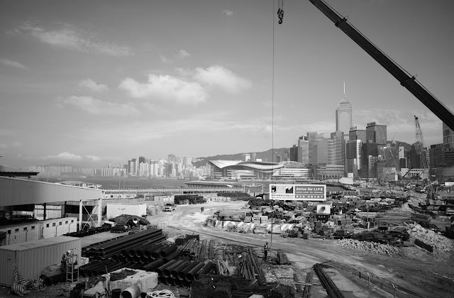
Hong Kong skyline shot over a building site...
M9 color DNG turned red filtered monochrome with DNGMonochrome... no sharpening or noise reduction... the sky turns darker, clouds jump out a bit more and the container in the left bottom corner completely changes 'color', as do numerous other objects in this photo, compared to the regular result...
The shown size here (640 pixels wide) is not the uploaded size. Click on the photo for the full 1280 pixel wide version...
I call it 'a virtual red filter' but I'm assuming a real red filter doesn't totally block green and blue like this method (guessing here, I have not investigated the workings of real red filters out there or what spectrum they cover... I assume you also have a choice there...). Essentially with this method, you're only looking at the full red or full blue result. That can be very interesting I think, but my advise would be if you do use these options: go for the more solid algorithm settings, and inspect the results carefully if you intend to print large.
Almost done
Well folks, I'm almost done... next part will be the conclusion of this series and I'll let you know how long you still have to wait to try this yourself...
... continue with conclusion
... back to part V

No comments:
Post a Comment