...what's lurking in your DNG files that you haven't seen yet?
Turning M9 color DNGs into monochrome DNGs
A series about the development of an experimental piece of software, called DNGMonochrome, able to convert color DNGs into monochrome DNGs...
The software is available here.
Now, before we continue, let me first show you one of my early results... else you might lose faith - with me droning on about things you might already know - or start to suspect that my last name is Frankenstein (it's not by the way... that would have been funny...)
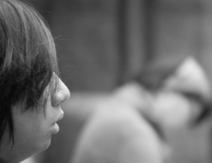
It's a color DNG turned into a monochrome DNG with DNGMonochrome - actually a bit of a world premiere - then imported into Lightroom. There I applied some exposure, brightness and contrast adaptations and then I exported it as JPG with a 100% quality setting.

Early on result from DNGMonochrome... photo was shot with Leica M9 and Summilux 50mm f/1.4 at ISO 200 (EV +0.7... most likely a mistake by turning the dial without noticing... I changed that option later on, because I kept making the same mistake)... no sharpening or noise reduction applied and no effects added... photo is shown the same size as exported (685 pixels wide)...
I also used this photo a lot in my experiments, so most examples are taken from this one. If you're the guy in the photo, my apologies in advance for abusing you like this.
At the end of this series I will show a larger version of this photo, possibly a link to a full size JPG.
And to make sure - you might still not be fully clear on the concept, since I've hardly explained it yet: this is not a color photo turned black & white the Lightroom way. It's an M9 DNG turned into a monochrome DNG outside Lightroom... then it was imported into Lightroom as monochrome DNG - Lightroom recognizes it's a monochrome DNG and skips the interpolation - and the JPG you see here is based on that monochrome DNG.
But you promised...
Yes, I know.
Let's continue, because at the end of part II, I was going to show you what a color DNG from the M9 looks like when we skip the color interpolation...
If you don't color interpolate, and you don't substitute the raw values for color values, and you possess some skills to get your RAW file to show up without all that (Google 'dcraw' if you want to try this yourself), you get this:
Now, you might have to get a bit closer to your screen to see what's wrong with it.
Zooming in even further on the photo, it becomes clear this isn't right.
The brighter parts are the green pixel values, the darker parts - within similar areas of brightness - are the blue and red pixel values. And in these examples (they are muddled up slightly, because they are JPG exports, which makes the distinction between red and blue - as different gray values - hard to make) the pixels haven't borrowed information from each other.
Luminance and chrominance
The green filtered pixels are brighter because they capture luminance values, whereas the red and blue filtered pixels register chrominance values. There are also twice as many green pixels compared to the red or blue pixels, as you can see in part II, if you look closely at the picture of the Bayer filter. Green is in the majority.
I will skip over this very important aspect, because explaining the difference between luminance (brightness) and chrominance (not to be confused with chromaticity, as explained here) isn't easy and a bit beyond these posts. So, lazy as I am, I leave it up to you and Google if you want to know more about these differences.
And the differences are important, because the method I'm using ignores some properties of the light captured. That's unavoidable, because those two (luminance and chrominance) belong to a color model, but I'm not interested in color (for now).
Ah well, Frankenstein (the first movie) was also in black & white... so let's continue shall we, and see what monster we can create...
(...yes, I know you liked the book better...)
Back to the photo
It's inescapable: there needs to be some borrowing going on to get to a more normal result.
But... as you can also see in the bigger photo higher up this page... the non interpolated black & white image is fairly clear. Without the interpolation you can still make out the image if you don't zoom in too far.
The green pixels didn't do a bad job.
It's the red and the blue pixels causing the biggest problem.
So even if you don't want color, you still have to do something with the raw file to turn it into a presentable image.
The Idea up close
So, back in my brain, the idea was simple enough: some of the color interpolation functions out there are based on algorithms that first look at the luminance part of the sensor pixels (registered by the green pixels). They interpolate the different pixels on luminance (by adjusting red and blue first, based on the luminance value of the green pixel).
It's known as gradient based interpolation.
So then I thought: what if you take such an algorithm, interpolate the values of an M9 DNG with it, and then put the new values for red and blue back into the DNG, telling it also it's now a monochrome DNG? Without disturbing the green pixels?
It's borrowing (red from green and blue from green), but it's very limited borrowing (green not from red and blue, red not from blue and blue not from red...).
Surprise!
Well, to my surprise - half of the time I hardly know what I'm doing - that actually worked. Then you get this:
Now, is that nice?
No... but this is an almost 1000% crop turned into JPG.
Here's two more reasonable crops, and let's start comparing a bit, time for some pixel peeping:
 Gradient interpolated version (first implementation) from the converted (now monochrome) M9 DNG - no sharpening or noise reduction applied...
 And here's the crop from the Lightroom (3.6) converted color DNG to B&W - no sharpening or noise reduction applied...
You decide which one you like better.
Now in color photos this gradient algorithm can cause some pretty nasty side effects on the edges, but since we're not dealing with color here, that doesn't seem to be much of a problem.
My own subjective observation:
- I think the Lightroom one looks slightly sharper
- I think the gradient one has the nicer background
Overall I wasn't unhappy with this result.
I had just interpolated my own photo.
Home made
It's a bit like growing your own flowers, making your own cheese, baking your own cake or brewing your own beer. Even if the flowers turn out puny, the cheese turns out green - when it should have been yellow - the cake collapses half burned, even if the beer doesn't get you drunk - just a bit nauseous - you still enjoy it: because you made it yourself.
But the joy about my home brewed photo didn't last when I compared the two crops, because the gradient algorithm hadn't done a very good job in resolving detail.
In fact, that part was a bit disappointing, since my idea and assumption were not confirmed.
Not that I had a very strong opinion about what the outcome should be, but I did expect a little bit more than this, especially in comparison with the Lightroom method.
Resolution, where are you?
So that led to an adaptation. A bit of a mix of different algorithms, now leaning more towards a ratio based approach, but keeping the edge detection properties of the gradient based approach.
And then things started to clear up...
 Ratio based algorithm... no additional sharpness applied... scroll back a bit to suddenly see the fuzziness in previous crops.... look at his hair...
I was actually quite surprised by this result.
I expected some improvement, but this - to my eye - seemed quite a leap.
It made me a little bit suspicious...
Suspicion
Because let me be honest here: I wasn't sure what I was looking at.
Is it more resolution, more sharpness, or just a more noisy 'gritty' algorithm that looks sharper but really isn't?
Is the more smooth result perhaps more 'true' and is this 'resolution' just fake?
Remember that interpolating is fancy guessing.
One could easily guess wrong.
I will get back to this in the more 'scientific' part of this series, because I do have a few answers, but it's a bit too early to talk about those...
At this point I just thought: for a 100% crop this doesn't look bad at all.
So I decided to stick with this approach for a while and run some more tests, which I will show you in the next part...
... continue with part IV
... back to part II


No comments:
New comments are not allowed.