Covering the white point and the color end points (red, green and blue) in previous post, I forgot about the black point.
It's the reference point for 'black'.
I tried to incorporate it, but I only have a few profiles which contain a black point setting.
And the problem is: all values for XYZ are zero in those profiles.
And zero for all values is a problem, because the conversion functions (from XYZ (3D) to xyY (2D) and then back) all result into zero if the big Y is zero.
It means: dragging the point doesn't lead to updated XYZ values. The zero Y (which is used unchanged in the conversion from xyY to XYZ) spoils it.
To actually still see the effect I fiddled a bit with Y (give it a value bigger than zero) but it doesn't seem to matter for the color conversion. XYZ then do update, but there's no changes in my proofing photo in none of the rendering intents (perceptual, relative, saturation or absolute).
It seems the black point isn't taken into consideration at all.
Could be that it only does 'something' in say Output profiles (for printers for instance). The color conversion functions in the Windows API only handle Display profiles, not Output profiles, but it could also be that it only has an effect when changed in the start profile (which I have to find out by using the multi-profile proofing, which isn't in place yet for the editors).
I'll investigate this a bit further, see if the photo should update or not and if I'm at fault here...

Saturday, September 3, 2011

Friday, September 2, 2011
The Point
And another one bites the dust...
Concentrating on the white point brought me mainly more knowledge about color spaces, but it's a bit much to try to explain it here.
The white point is the point within the color space that 'defines' white and is then taken as a reference point for the colors surrounding it. It's stored in the ICC profiles with three values (XYZ). However, shifting it around within the color space, only leads to changes in the proofing photo when the rendering intent is set to ' Absolute'. The other rendering intents (perceptual, relative and saturation) do not react on a changed white point, as I found out by building this thing.
Let me just tell you that I had to collect some knowledge about the XYZ color space (which is a 3D representation of infinite colors) and how to convert it to a 2D xyY representation (and back again). After that things became easy.
Monitors most of the time work in the sRGB color space, which is basically just a small defined chunk out of the XYZ space and actually quite limited. Other working color spaces are CMYK (for printers) and for instance AdobeRGB, which covers more of the XYZ space than sRGB.
So, I designed myself a second editor, one for color points (and the white point), and on the grid you can drag the points around and see the changes in the photo.
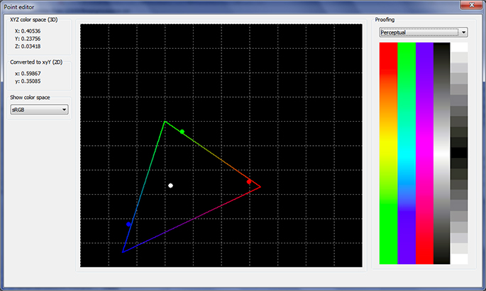 The point editor, showing the white point, the three primary color points and the reference sRGB triangle, with the standard proofing photo on the right...
Some funny results can be achieved by dragging the white point out of the sRGB color space (defined by the triangle) or by reversing the color points (make blue change to red and v.v).
The color points define the boundries of the color space of the profile, and dragging them around has an effect in all rendering intents (not just in the Absolute one like the white point). The editor handles all the points in one screen: the white point and the three primary color points.
After profiling a monitor, the software that comes with the colorimeter (in my case the Spyder 3) usually shifts the color points a bit within the produced profile, depending on the measurements of the colors on the screen. In theory these points (red, green and blue) are the three corners of the sRGB triangle but in a produced profile they usually form their own triangle that doesn't totally match. It really depends on your hardware how well it fits into the actual sRGB space.
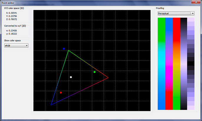 The point editor, showing the proofing image with all the color points swapped... compare it with previous picture and you' ll see that all the colors in the proofing picture have changed place...
The triangle as written, represents the sRGB working space, the usual space for display color profiles. I can also select other 'triangles' in the drop down on the left, covering AdobeRGB, Adobe Wide Gamut RGB, ProPhotoRGB, AppleRGB and some more obscure other formats. They are just a reference though. The colored triangle doesn't have any influence on the color profile.
All these color spaces are bound by defined coordinates within the total XYZ space and easy to reproduce as shapes on a 2D grid. For editing the white and end points in display profiles these additional triangles are only a nice to have, because they don't provide very useful information on a sRGB device. Mind you, the XYZ space is much larger and embeds basically all those sRGB/AdobeRGB/AppleRGB etc. shapes.
I decided not to paint the XYZ one, as to keep the grid simple, but also because it's not easy to draw without the right formulas. It's not a simple triangle like the sRGB space. Another problem is that the examples of pictures of this XYZ color space are deceiving. They are usually colored in, but because your monitor can only show colors within the sRGB space, the colors you see in those examples are never correct.
Here's a youtube that explains what XYZ actually means: http://www.youtube.com/watch?v=x0-qoXOCOow
In essence this is the whole point of color profiles: to translate and convert between the different color spaces.
Is it useful to edit these details in a color profile?
Well, I'm not sure. I do see some potential for creativity, because you can create some bizare effects on whole batches of photos by creating whacky color profiles and yes, in some cases you might want to adapt these points slightly if you're not happy with an automatically produced profile.
And if anything, playing around with this type of software does give you a pretty good insight in what the different parts of a color profile actually do, and what results to expect when you select it in your color managed application.
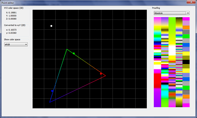 The point editor, showing another very whacky result, accomplished by dragging away the white point...
Personally I find it strange that the supplied software of the Spyder3 doesn't give this level of control, since it's not that difficult to edit this stuff (as proven by a complete color novice). If it's wise, smart or stupid to wánt to edit a color profile, that's nobody's business but the user's...
Ah well, I can now more or less do what I wanted to do with my produced display profiles.
After this there's one more tag to inspect, the CHAD, or CHromatic ADaptation and I have to see if I need to incorporate data about the for now somewhat mysterious D50/D65 parameters... At this point I just know it's kind of a translation thing and probably has no effect on the rendering when changed, but it's in version 4 display profiles, so let's investigate...
Concentrating on the white point brought me mainly more knowledge about color spaces, but it's a bit much to try to explain it here.
The white point is the point within the color space that 'defines' white and is then taken as a reference point for the colors surrounding it. It's stored in the ICC profiles with three values (XYZ). However, shifting it around within the color space, only leads to changes in the proofing photo when the rendering intent is set to ' Absolute'. The other rendering intents (perceptual, relative and saturation) do not react on a changed white point, as I found out by building this thing.
Let me just tell you that I had to collect some knowledge about the XYZ color space (which is a 3D representation of infinite colors) and how to convert it to a 2D xyY representation (and back again). After that things became easy.
Monitors most of the time work in the sRGB color space, which is basically just a small defined chunk out of the XYZ space and actually quite limited. Other working color spaces are CMYK (for printers) and for instance AdobeRGB, which covers more of the XYZ space than sRGB.
So, I designed myself a second editor, one for color points (and the white point), and on the grid you can drag the points around and see the changes in the photo.
 The point editor, showing the white point, the three primary color points and the reference sRGB triangle, with the standard proofing photo on the right...
Some funny results can be achieved by dragging the white point out of the sRGB color space (defined by the triangle) or by reversing the color points (make blue change to red and v.v).
The color points define the boundries of the color space of the profile, and dragging them around has an effect in all rendering intents (not just in the Absolute one like the white point). The editor handles all the points in one screen: the white point and the three primary color points.
After profiling a monitor, the software that comes with the colorimeter (in my case the Spyder 3) usually shifts the color points a bit within the produced profile, depending on the measurements of the colors on the screen. In theory these points (red, green and blue) are the three corners of the sRGB triangle but in a produced profile they usually form their own triangle that doesn't totally match. It really depends on your hardware how well it fits into the actual sRGB space.
 The point editor, showing the proofing image with all the color points swapped... compare it with previous picture and you' ll see that all the colors in the proofing picture have changed place...
The triangle as written, represents the sRGB working space, the usual space for display color profiles. I can also select other 'triangles' in the drop down on the left, covering AdobeRGB, Adobe Wide Gamut RGB, ProPhotoRGB, AppleRGB and some more obscure other formats. They are just a reference though. The colored triangle doesn't have any influence on the color profile.
All these color spaces are bound by defined coordinates within the total XYZ space and easy to reproduce as shapes on a 2D grid. For editing the white and end points in display profiles these additional triangles are only a nice to have, because they don't provide very useful information on a sRGB device. Mind you, the XYZ space is much larger and embeds basically all those sRGB/AdobeRGB/AppleRGB etc. shapes.
I decided not to paint the XYZ one, as to keep the grid simple, but also because it's not easy to draw without the right formulas. It's not a simple triangle like the sRGB space. Another problem is that the examples of pictures of this XYZ color space are deceiving. They are usually colored in, but because your monitor can only show colors within the sRGB space, the colors you see in those examples are never correct.
Here's a youtube that explains what XYZ actually means: http://www.youtube.com/watch?v=x0-qoXOCOow
In essence this is the whole point of color profiles: to translate and convert between the different color spaces.
Is it useful to edit these details in a color profile?
Well, I'm not sure. I do see some potential for creativity, because you can create some bizare effects on whole batches of photos by creating whacky color profiles and yes, in some cases you might want to adapt these points slightly if you're not happy with an automatically produced profile.
And if anything, playing around with this type of software does give you a pretty good insight in what the different parts of a color profile actually do, and what results to expect when you select it in your color managed application.
 The point editor, showing another very whacky result, accomplished by dragging away the white point...
Personally I find it strange that the supplied software of the Spyder3 doesn't give this level of control, since it's not that difficult to edit this stuff (as proven by a complete color novice). If it's wise, smart or stupid to wánt to edit a color profile, that's nobody's business but the user's...
Ah well, I can now more or less do what I wanted to do with my produced display profiles.
After this there's one more tag to inspect, the CHAD, or CHromatic ADaptation and I have to see if I need to incorporate data about the for now somewhat mysterious D50/D65 parameters... At this point I just know it's kind of a translation thing and probably has no effect on the rendering when changed, but it's in version 4 display profiles, so let's investigate...
Tuesday, August 30, 2011
The Editor
[Please note that this post is part of a series describing my first wobbly steps into the world of ICC color profiles. The aim is to build an ICC color profile editor from scratch. Seeing how I started this project with no knowledgde whatsoever on the subject, it's wise to realise that some of my findings described in these posts are incorrect. The incorrect conclusions are usually corrected in later posts. For the whole series in one go, click here.]
So, the curve editor I wrote for this color project is approaching its final stages. It still lacks some functionality, but for testing purposes it's quite ok now. Let me show you some examples...
The editor itself is the big black square with the curves, and next to it on the right is the standard proofing picture I use. There will be the option later on to load a random photo, but this thing covers at least the basics: colors and grays.
The first picture is a random profile and you see the TRC curves, all blended together (red, green and blue) in a gamma 2.2 curve.
(for real it looks a bit clearer, the JPG quality and down scaling make the screenshots a bit fuzzy).

Then in the second picture you see I've pulled blue down and the effect is immediately visible in the color transition in the picture on the right (grays turning blue).

With the control point setting on the left I can switch the number of vertical lines in the editor. It means I can set the number of 'points' to pull or push the curve. The more points, the smaller the changes. The nicest curves are actually created with a low number of control points. Gives very smooth results. The highest number of points is 32.
In picture 3 you see the curves out of control in an 8 point setting and the color translation becomes unusable, with the grays especially in the mid tones and highlights turning into everything but gray...

And as you can see, it's actually not that easy to spot that this is a totally whacked color profile if you only focus on the colors. It seems to be the grays that tell the story the quickest. Gray is always a combination of a similar amount of red, green and blue. Any deviation is quickly spotted if you concentrate on the gray scale.
For calibration the editor works basically the same, but the curves have an opposite effect when they move. Pulling blue down decreases blue in the calibration, but with the TRC pulling blue down increases blue through the color translation.
I've still some work left to change the TRCs that are stored as parametric curves (those only have the gamma stored as a number, but not a whole curve) and then I can move on to more daunting parts of a profile: the gamut! (or something :-) )
So, the curve editor I wrote for this color project is approaching its final stages. It still lacks some functionality, but for testing purposes it's quite ok now. Let me show you some examples...
The editor itself is the big black square with the curves, and next to it on the right is the standard proofing picture I use. There will be the option later on to load a random photo, but this thing covers at least the basics: colors and grays.
The first picture is a random profile and you see the TRC curves, all blended together (red, green and blue) in a gamma 2.2 curve.
(for real it looks a bit clearer, the JPG quality and down scaling make the screenshots a bit fuzzy).

Then in the second picture you see I've pulled blue down and the effect is immediately visible in the color transition in the picture on the right (grays turning blue).

With the control point setting on the left I can switch the number of vertical lines in the editor. It means I can set the number of 'points' to pull or push the curve. The more points, the smaller the changes. The nicest curves are actually created with a low number of control points. Gives very smooth results. The highest number of points is 32.
In picture 3 you see the curves out of control in an 8 point setting and the color translation becomes unusable, with the grays especially in the mid tones and highlights turning into everything but gray...

And as you can see, it's actually not that easy to spot that this is a totally whacked color profile if you only focus on the colors. It seems to be the grays that tell the story the quickest. Gray is always a combination of a similar amount of red, green and blue. Any deviation is quickly spotted if you concentrate on the gray scale.
For calibration the editor works basically the same, but the curves have an opposite effect when they move. Pulling blue down decreases blue in the calibration, but with the TRC pulling blue down increases blue through the color translation.
I've still some work left to change the TRCs that are stored as parametric curves (those only have the gamma stored as a number, but not a whole curve) and then I can move on to more daunting parts of a profile: the gamut! (or something :-) )
Friday, August 26, 2011
Those TRCs
[Please note that this post is part of a series describing my first wobbly steps into the world of ICC color profiles. The aim is to build an ICC color profile editor from scratch. Seeing how I started this project with no knowledgde whatsoever on the subject, it's wise to realise that some of my findings described in these posts are incorrect. The incorrect conclusions are usually corrected in later posts. For the whole series in one go, click here.]
So, my assumption in previous color post turned out to be correct: The TRCs (Tone Reproduction Curve) work on the actual color translation.
It's a similar effect as the calibration curves have on the screen.
When I edit the TRCs, the colors of my proofing photo change, even when calibration is turned off.
Mind you, I'm still struggling with some problems. The TRCs are stored quite differently per profile. Sometimes 256 values, sometimes 512 values, sometimes as a parametric curve. And more annoyingly: they seem to work in the reverse direction. Pulling blue down increases blue in the color transformation, as opposed to the calibration curves.
I'm not fully sure if that's supposed to happen or if I am making programming mistakes here. Seeing how my changes (after saving) result in the expected (changed) curve when I reopen the profile, I'm inclined to believe this is what's supposed to happen...
I do have some ways of testing that, so that's one of the things to try out.
And it's not hard to understand why the hardware (the colorimeter) is necessary, because it's almost impossible to tweak these things on sight, especially since I'm now dealing with six curves (calibration and profiling), which all have an effect on the colors.
I don't intend to edit TRC curves at this point (although the application will be able to). Most of my profiles have 'gamma 2.2' stored in the TRC (as text) and that seems to be sufficient. I was a bit unsure about TRCs claiming gamma 2.2 without any additional curve data stored, but I guess now that the color translator (the CMM) knows how to deal with this.
A gamma curve isn't difficult to create when the value is known.
It will however be one of my next steps anyway: figure out what happens in profiles that don't have TRC data, but simply 'gamma #.#' stated. Does the gamma indeed adapt in the photo when I change it from 2.2 to say 1.8?
Once that's done, I think my profile editor needs a name and will see the daylight as a first version of a more elaborate application, because there's still more to edit.
Will take some time though, first I have to tame those TRCs in all their incarnations...
So, my assumption in previous color post turned out to be correct: The TRCs (Tone Reproduction Curve) work on the actual color translation.
It's a similar effect as the calibration curves have on the screen.
When I edit the TRCs, the colors of my proofing photo change, even when calibration is turned off.
Mind you, I'm still struggling with some problems. The TRCs are stored quite differently per profile. Sometimes 256 values, sometimes 512 values, sometimes as a parametric curve. And more annoyingly: they seem to work in the reverse direction. Pulling blue down increases blue in the color transformation, as opposed to the calibration curves.
I'm not fully sure if that's supposed to happen or if I am making programming mistakes here. Seeing how my changes (after saving) result in the expected (changed) curve when I reopen the profile, I'm inclined to believe this is what's supposed to happen...
I do have some ways of testing that, so that's one of the things to try out.
And it's not hard to understand why the hardware (the colorimeter) is necessary, because it's almost impossible to tweak these things on sight, especially since I'm now dealing with six curves (calibration and profiling), which all have an effect on the colors.
I don't intend to edit TRC curves at this point (although the application will be able to). Most of my profiles have 'gamma 2.2' stored in the TRC (as text) and that seems to be sufficient. I was a bit unsure about TRCs claiming gamma 2.2 without any additional curve data stored, but I guess now that the color translator (the CMM) knows how to deal with this.
A gamma curve isn't difficult to create when the value is known.
It will however be one of my next steps anyway: figure out what happens in profiles that don't have TRC data, but simply 'gamma #.#' stated. Does the gamma indeed adapt in the photo when I change it from 2.2 to say 1.8?
Once that's done, I think my profile editor needs a name and will see the daylight as a first version of a more elaborate application, because there's still more to edit.
Will take some time though, first I have to tame those TRCs in all their incarnations...
Thursday, August 25, 2011
Waiter
 ...trying to sell his pizzas, but the potential customers aren't convinced yet...
Rome, 19 July 2011
Click on photo for the full version...
Wednesday, August 24, 2011
Curving...
[Please note that this post is part of a series describing my first wobbly steps into the world of ICC color profiles. The aim is to build an ICC color profile editor from scratch. Seeing how I started this project with no knowledgde whatsoever on the subject, it's wise to realise that some of my findings described in these posts are incorrect. The incorrect conclusions are usually corrected in later posts. For the whole series in one go, click here.]
So what's the situation at the moment on the color front?
Well, I had to spend some time on the curve editor, to be able to actually change the calibration.
As you know, last time I was able to get to the calibration curves of any ICC profile, and show them.
At this point I'm actually able to change them and see the effect. In essence I'm done with what I wanted: adapt my ugly grays. Lifting the blue slightly solves my problem. The last thing I need to do is save the edited data, a minor task.
Of course that's not enough, because now I'm intrigued!
The next step is to concentrate on the TRC's and accomplish a similar thing: edit them and experience the effect of my changes.
What is that effect?
I'm not fully sure yet, but I suspect the TRC's do a similar thing as the calibration curves, but in the actual color transition. Because here's the thing:
I have two profiles with the same calibration curves, but different TRC curves, and obviously, when switching between profiles, my screen stays the same, but the colors of the photo change. So my guess is that adapting the TRC's will actually change the colors through the color translation... Also something I will find out when I connect the editing of the curves to the 'live' TRC data and make a direct link with the color translating, being able to see the effect instantly.
It's less useful, because I think editing a profile manually this way will lead to color chaos, but for tiny changes and small tweaks it might be useful.
After that I want to have a look at the white point and the color end points (I believe they have to do with the 'gamut').
If I can also change those and see the effect I'm pretty sure there's not much else left where display profiles in the sRGB color space are concerned...
So what's the situation at the moment on the color front?
Well, I had to spend some time on the curve editor, to be able to actually change the calibration.
As you know, last time I was able to get to the calibration curves of any ICC profile, and show them.
At this point I'm actually able to change them and see the effect. In essence I'm done with what I wanted: adapt my ugly grays. Lifting the blue slightly solves my problem. The last thing I need to do is save the edited data, a minor task.
Of course that's not enough, because now I'm intrigued!
The next step is to concentrate on the TRC's and accomplish a similar thing: edit them and experience the effect of my changes.
What is that effect?
I'm not fully sure yet, but I suspect the TRC's do a similar thing as the calibration curves, but in the actual color transition. Because here's the thing:
I have two profiles with the same calibration curves, but different TRC curves, and obviously, when switching between profiles, my screen stays the same, but the colors of the photo change. So my guess is that adapting the TRC's will actually change the colors through the color translation... Also something I will find out when I connect the editing of the curves to the 'live' TRC data and make a direct link with the color translating, being able to see the effect instantly.
It's less useful, because I think editing a profile manually this way will lead to color chaos, but for tiny changes and small tweaks it might be useful.
After that I want to have a look at the white point and the color end points (I believe they have to do with the 'gamut').
If I can also change those and see the effect I'm pretty sure there's not much else left where display profiles in the sRGB color space are concerned...
Saturday, August 20, 2011
GOG?
[Please note that this post is part of a series describing my first wobbly steps into the world of ICC color profiles. The aim is to build an ICC color profile editor from scratch. Seeing how I started this project with no knowledgde whatsoever on the subject, it's wise to realise that some of my findings described in these posts are incorrect. The incorrect conclusions are usually corrected in later posts. For the whole series in one go, click here.]
I'm starting to understand why color software is so expensive, and seriously, people programming that stuff must be extreme geeks... my rating has gone up quite a bit since I dove into this project, and I think if you read it all, you'll agree... I gained quite a few points on the geek meter!
And seriously folks, I haven't even scratched the surface. In my color quest I have run into some pretty scary math... let's not talk about that yet...
If you want to read my earlier posts on the subject, click here, that will show you all four posts, that's including this one.
I left you last time with a little bit of knowledge about TRC tags and their content.
I was right in that post: The Tone Reproduction Curve isn't the thing that's loaded into the video card. For the calibration I needed the separate vendor specific tag, called VCGT (Video Card Gamma Table). It was developed by Apple, and my mysterious spyder profile uses it.
And yes, I succeeded in loading that data straight into my video card and see the immediate effect it has on my desktop (ugly yellow grays).
My application now shows all the color profiles on my system, and if it's a display profile it gets loaded immediately when I select it (my whole screen changes) and then the color bit is applied to a photo and the photo is converted.
It's a two step process and works pretty well.
And yes, now my photo does show the yellowish grays, because my screen changed.
But wait... I also have my regular profile with the nice grays, so comparing the bad profile with the good one would be nice.
But of course, nothing is easy in computer land: the good profile doesn't have a VCGT tag!
So where to get my calibration data from, I wondered? Obviously it's in the profile somewhere.
Well, that profile is made by Microsoft.
They don't use an Apple tag (who can blame them), but in stead they integrate their own system (called Windows Color System or WCS) in the ICC profile with their own 'MS00' tag.
So there you have it... there's:
- TRC tags with data and sometimes just stating 'gamma #.#' (I now think that's dependant on the ICC profile version, 2 or 4)
- VCGT tag, which holds the calibration data for the video card
- MS00 tag, which holds the WCS implementation as XML (mind you, that's way more than just the calibration data, it's a full WCS profile)
So far I've only seen either VCGT or MS00, but not together.
So what happens if both are lacking? I don't know. Perhaps no calibration is done then, or the TRC is used after all. It's something I can figure out once the application can also edit the curves.
I proceeded with the MS00 tag and extracted the XML from the ICC profile and had a look.
Confusingly enough (remember, even with TRC tags in the spyder profile, the calibration data came from the VCGT tag), Microsoft calls its calibration data also TRC... and more confusing, they store it differently (not as a collection of 256 numbers per color channel but as parameterized curves). Took me a few hours of futile experimenting (I was close but not close enough) and then the Internet, but then I found it: WCS uses the GOG model (Gain / Offset / Gamma) to describe the gamma ramp. The first math I found looked incomprehensible, but eventually I found some documentation describing it, and it's quite a simple formula.
And it works.
Now I can select profiles containing the VCGT tag or the MS00 tag, and the effect is shown immediately on my screen, and in pretty curves too and the desktop looks exactly the same as loading them through the official Windows Color Management module...
Obviously there's a big hurdle to take, because of the WCS and GOG approach: it calculates curves based on three numbers. How to get back to the three numbers after editing the curve? Something tells me that might be complicated if the curve is edited out of shape too much... oh well, I will deal with that when I get there...
Here's the curves for the spyder profile (VCGT) and the second picture are the curves (GOG) from my regular profile. Only the top curves are used in the calibration of the monitor. At this point I'm not sure what the TRC's are used for exactly but I'm sure once I can change them and see the effect, I'll find out... You can see where the yellow is coming from in the spyder profile (overlapping red and green with blue pushed down too much...)... A white curve means all colors are blended together, so the three curves are similar...

The curves of the dirty gray profile (curves are coming from the VCGT tag)...

Curves of the clean grays profile (the one I'm using now - curves are based on the WCS GOG model)...
I'm starting to understand why color software is so expensive, and seriously, people programming that stuff must be extreme geeks... my rating has gone up quite a bit since I dove into this project, and I think if you read it all, you'll agree... I gained quite a few points on the geek meter!
And seriously folks, I haven't even scratched the surface. In my color quest I have run into some pretty scary math... let's not talk about that yet...
If you want to read my earlier posts on the subject, click here, that will show you all four posts, that's including this one.
I left you last time with a little bit of knowledge about TRC tags and their content.
I was right in that post: The Tone Reproduction Curve isn't the thing that's loaded into the video card. For the calibration I needed the separate vendor specific tag, called VCGT (Video Card Gamma Table). It was developed by Apple, and my mysterious spyder profile uses it.
And yes, I succeeded in loading that data straight into my video card and see the immediate effect it has on my desktop (ugly yellow grays).
My application now shows all the color profiles on my system, and if it's a display profile it gets loaded immediately when I select it (my whole screen changes) and then the color bit is applied to a photo and the photo is converted.
It's a two step process and works pretty well.
And yes, now my photo does show the yellowish grays, because my screen changed.
But wait... I also have my regular profile with the nice grays, so comparing the bad profile with the good one would be nice.
But of course, nothing is easy in computer land: the good profile doesn't have a VCGT tag!
So where to get my calibration data from, I wondered? Obviously it's in the profile somewhere.
Well, that profile is made by Microsoft.
They don't use an Apple tag (who can blame them), but in stead they integrate their own system (called Windows Color System or WCS) in the ICC profile with their own 'MS00' tag.
So there you have it... there's:
- TRC tags with data and sometimes just stating 'gamma #.#' (I now think that's dependant on the ICC profile version, 2 or 4)
- VCGT tag, which holds the calibration data for the video card
- MS00 tag, which holds the WCS implementation as XML (mind you, that's way more than just the calibration data, it's a full WCS profile)
So far I've only seen either VCGT or MS00, but not together.
So what happens if both are lacking? I don't know. Perhaps no calibration is done then, or the TRC is used after all. It's something I can figure out once the application can also edit the curves.
I proceeded with the MS00 tag and extracted the XML from the ICC profile and had a look.
Confusingly enough (remember, even with TRC tags in the spyder profile, the calibration data came from the VCGT tag), Microsoft calls its calibration data also TRC... and more confusing, they store it differently (not as a collection of 256 numbers per color channel but as parameterized curves). Took me a few hours of futile experimenting (I was close but not close enough) and then the Internet, but then I found it: WCS uses the GOG model (Gain / Offset / Gamma) to describe the gamma ramp. The first math I found looked incomprehensible, but eventually I found some documentation describing it, and it's quite a simple formula.
And it works.
Now I can select profiles containing the VCGT tag or the MS00 tag, and the effect is shown immediately on my screen, and in pretty curves too and the desktop looks exactly the same as loading them through the official Windows Color Management module...
Obviously there's a big hurdle to take, because of the WCS and GOG approach: it calculates curves based on three numbers. How to get back to the three numbers after editing the curve? Something tells me that might be complicated if the curve is edited out of shape too much... oh well, I will deal with that when I get there...
Here's the curves for the spyder profile (VCGT) and the second picture are the curves (GOG) from my regular profile. Only the top curves are used in the calibration of the monitor. At this point I'm not sure what the TRC's are used for exactly but I'm sure once I can change them and see the effect, I'll find out... You can see where the yellow is coming from in the spyder profile (overlapping red and green with blue pushed down too much...)... A white curve means all colors are blended together, so the three curves are similar...
The curves of the dirty gray profile (curves are coming from the VCGT tag)...
Curves of the clean grays profile (the one I'm using now - curves are based on the WCS GOG model)...
Thursday, August 18, 2011
The Ramp
[Please note that this post is part of a series describing my first wobbly steps into the world of ICC color profiles. The aim is to build an ICC color profile editor from scratch. Seeing how I started this project with no knowledgde whatsoever on the subject, it's wise to realise that some of my findings described in these posts are incorrect. The incorrect conclusions are usually corrected in later posts. For the whole series in one go, click here.]
Well, I'm not sure if anyone is actually reading this, but I made some progress.
Small steps...
If you remember, last time I figured out that my dirty grays were due to the calibration part of the color profile, and that my dirty screen didn't have anything to do with the color translation math within the profile (I'm not even sure if you can call it that mind you, the math to convert colors is actually done by something called a CMM, but let's not get into that)...
Turns out the stuff that makes my screen itch is indeed part of the video card, and it's called a gamma-ramp.
The numbers within the gamma-ramp are causing the yellow cast.
Then I found two useful functions in the Windows API, to read and set the gamma ramp of the video card.
I then built myself a little component to actually show the curves - a fascinating detour in the world of linear functions, splines and bezier curves - and there I had it...
Of the three colors that make up my screen (red, green and blue) blue gamma was pulled away too much, resulting in unbalanced grays.
Then I figured out that within a color profile, the numbers that look like the gamma ramp, are stored in what's called TRC tags (Tone Reproduction Curve). There's four of those, but my system can only handle three (red, green, and blue, the fourth one is for gray).
Well, so far so good.
I'm now able to browse through a list of color profiles, show the effect on a loaded photo, and show TRC's stored in the profile.
Obviously, the next step is to actually load those curves straight into the video card (and make that optional), so the calibration effect of the gamma curves in color profiles for a display is immediately visible.
Then to complete this phase and to be able to correct the yellow cast, I need to make the curves editable.
But of course I ran into a snag, which I haven't figured out yet.
The snag
The gamma curves differ.
When I read the data directly from the profile, I get different curves then when I read the gamma-ramp from the video card after the profile is loaded.
Quite simple: the profile TRC data can't be applied directly to the gamma-ramp in the video card. There's a bit of calculus involved, and I haven't figured out yet what the formula is.
I now suspect the TRC tags themselves are just a standard setting, and the deviation for dark, middle and light tones sits in a private tag, because the TRC tags in some profiles do not actually point to a collection of numbers at all, but to a small piece of text saying 'gamma 2.2'. I understand what the text means, and gamma 2.2 is easy to create as a lookup table, but now I have to figure out how my gamma ramp in the video card gets out of whack when the curves just state 'gamma 2.2' (because they do in my mysterious spyder profile).
Where are the numbers coming from? If it was just a standard calculation I wouldn't have yellow grays, but neutral grays. No doubt they're coming from another tag in the profile (possibly vendor specific), because my video card doesn't know what 'gamma 2.2' means. It needs the numbers. So... I need to delve deeper into the profile...
I'll get there...
Well, I'm not sure if anyone is actually reading this, but I made some progress.
Small steps...
If you remember, last time I figured out that my dirty grays were due to the calibration part of the color profile, and that my dirty screen didn't have anything to do with the color translation math within the profile (I'm not even sure if you can call it that mind you, the math to convert colors is actually done by something called a CMM, but let's not get into that)...
Turns out the stuff that makes my screen itch is indeed part of the video card, and it's called a gamma-ramp.
The numbers within the gamma-ramp are causing the yellow cast.
Then I found two useful functions in the Windows API, to read and set the gamma ramp of the video card.
I then built myself a little component to actually show the curves - a fascinating detour in the world of linear functions, splines and bezier curves - and there I had it...
Of the three colors that make up my screen (red, green and blue) blue gamma was pulled away too much, resulting in unbalanced grays.
Then I figured out that within a color profile, the numbers that look like the gamma ramp, are stored in what's called TRC tags (Tone Reproduction Curve). There's four of those, but my system can only handle three (red, green, and blue, the fourth one is for gray).
Well, so far so good.
I'm now able to browse through a list of color profiles, show the effect on a loaded photo, and show TRC's stored in the profile.
Obviously, the next step is to actually load those curves straight into the video card (and make that optional), so the calibration effect of the gamma curves in color profiles for a display is immediately visible.
Then to complete this phase and to be able to correct the yellow cast, I need to make the curves editable.
But of course I ran into a snag, which I haven't figured out yet.
The snag
The gamma curves differ.
When I read the data directly from the profile, I get different curves then when I read the gamma-ramp from the video card after the profile is loaded.
Quite simple: the profile TRC data can't be applied directly to the gamma-ramp in the video card. There's a bit of calculus involved, and I haven't figured out yet what the formula is.
I now suspect the TRC tags themselves are just a standard setting, and the deviation for dark, middle and light tones sits in a private tag, because the TRC tags in some profiles do not actually point to a collection of numbers at all, but to a small piece of text saying 'gamma 2.2'. I understand what the text means, and gamma 2.2 is easy to create as a lookup table, but now I have to figure out how my gamma ramp in the video card gets out of whack when the curves just state 'gamma 2.2' (because they do in my mysterious spyder profile).
Where are the numbers coming from? If it was just a standard calculation I wouldn't have yellow grays, but neutral grays. No doubt they're coming from another tag in the profile (possibly vendor specific), because my video card doesn't know what 'gamma 2.2' means. It needs the numbers. So... I need to delve deeper into the profile...
I'll get there...
Saturday, August 13, 2011
Me And The Mysterious Spyder
[Please note that this post is part of a series describing my first wobbly steps into the world of ICC color profiles. The aim is to build an ICC color profile editor from scratch. Seeing how I started this project with no knowledgde whatsoever on the subject, it's wise to realise that some of my findings described in these posts are incorrect. The incorrect conclusions are usually corrected in later posts. For the whole series in one go, click here.]
So, how far am I with my color quest? Well...
I have part of it under control in my fledgeling application... I can select a profile and see the consequences in a loaded picture, JPG or otherwise. I can also show color transitions between two profiles...
But here's the deal: it didn't make a lot of sense so far.
I think I know why...
The profile the Spyder made, shows horrible grays when I load it into Windows.
But, when I select the profile to convert a photo (under my regular color profile with normal grays loaded into Windows), the grays of the converted photo (converted from regular to the spyder profile) stay gray. The colors change - I can see the adaptation - but the yellow cast isn't there, and the colors don't seem outrageous at all.
That didn't make sense to me.
I expected yellow grays to show up in the photo, since yellow grays is what I see when I load the profile into Windows 7.
Now, I had written a long story about this, with possible causes, but then I stumbled upon a website which claimed something simple I wasn't fully aware of: loading the profile into Windows 7 does change the monitor settings (called 'calibration'), but NOT the colors (called 'profiling') - of course, the colors look changed due to the monitor calibration being different, but it's not due to any color conversion going on - there's no conversion between an sRGB standard profile and the Spyder's one.
That totally made sense.
A color managed application has to explicitly convert the photos it shows, using the profile set by windows with a possible starting point being an embedded profile in the photo itself (or standard sRGB if no profile is embedded). And the desktop and any 'color unmanaged' application is not following the color part of the profile: it's only following the calibration part (it can't escape that, because calibration is done through the video card).
The yellow cast is caused by something in the video card's LUT (LookUp Table), not by the color conversion in the profile.
Mind you - to add to my confusion - a color profile can be set to four different rendering intents (the way a photo is 'painted' to the screen). And the Spyder profile does produce yellow cast in a converted photo when I set it to render Absolute in stead of Perceptual. That might (or not) be an indication what it is in the LUT causing the yellow cast, since the renderings differ for instance in how they treat the white point. It could be that the loaded profile uses an absolute setting where the LUT is concerned... but I'm speculating here.
This whole business was confirmed by testing with a completely different profile selected in a color managed application - Photoshop - with that weird Spyder profile loaded into Windows... the yellow grays stayed, no matter which profile I selected in the proofing part of Photoshop...
The yellow cast is like a completely different property that's skipped by the color management functions. I couldn't get a black and white photo to look black and white on my screen, no matter which profile I selected in the proofing module.
Imagine: my color transitions work fine, but it's as if someone (the video card) draped a yellowish filter over the screen.
I'm not sure how to deal with this problem, nor what's causing this specifically.
It's not the color transformation math. So does the LUT contain a seperate entry for grays? Is it the gamma? Has it to do with the white point?
In the case of 'Me And The Mysterious Spyder' it seems I'll have to tweak the video card portion of the profile, not so much the color part... but at the moment the knowledge is lacking on how the two interact...
I'm still a bit unclear on the interaction, because I can't imagine the profile designed specifically for my monitor by the Spyder doesn't somehow mix the two. If I tweak the LUT part, is the color part still correct or is the color transformation actually counting on a lack of one of the color channels?
Well, let's find out...
So it's back to the documentation, I guess you now understand why, seeing my confusion about the subject :-)
In the meantime I'll work further on the proofing part, because I have an explanation for the lacking yellow in converted photos, so the application is actually working properly so far...
I contemplated showing you the examples, but your browser might be color managed, in which case you probably would see something different than what I am seeing. And apart from the philosophical questions one can also ask (are you seeing what I'm seeing and how to confirm that?), this subject is unclear enough as it is...
So, how far am I with my color quest? Well...
I have part of it under control in my fledgeling application... I can select a profile and see the consequences in a loaded picture, JPG or otherwise. I can also show color transitions between two profiles...
But here's the deal: it didn't make a lot of sense so far.
I think I know why...
The profile the Spyder made, shows horrible grays when I load it into Windows.
But, when I select the profile to convert a photo (under my regular color profile with normal grays loaded into Windows), the grays of the converted photo (converted from regular to the spyder profile) stay gray. The colors change - I can see the adaptation - but the yellow cast isn't there, and the colors don't seem outrageous at all.
That didn't make sense to me.
I expected yellow grays to show up in the photo, since yellow grays is what I see when I load the profile into Windows 7.
Now, I had written a long story about this, with possible causes, but then I stumbled upon a website which claimed something simple I wasn't fully aware of: loading the profile into Windows 7 does change the monitor settings (called 'calibration'), but NOT the colors (called 'profiling') - of course, the colors look changed due to the monitor calibration being different, but it's not due to any color conversion going on - there's no conversion between an sRGB standard profile and the Spyder's one.
That totally made sense.
A color managed application has to explicitly convert the photos it shows, using the profile set by windows with a possible starting point being an embedded profile in the photo itself (or standard sRGB if no profile is embedded). And the desktop and any 'color unmanaged' application is not following the color part of the profile: it's only following the calibration part (it can't escape that, because calibration is done through the video card).
The yellow cast is caused by something in the video card's LUT (LookUp Table), not by the color conversion in the profile.
Mind you - to add to my confusion - a color profile can be set to four different rendering intents (the way a photo is 'painted' to the screen). And the Spyder profile does produce yellow cast in a converted photo when I set it to render Absolute in stead of Perceptual. That might (or not) be an indication what it is in the LUT causing the yellow cast, since the renderings differ for instance in how they treat the white point. It could be that the loaded profile uses an absolute setting where the LUT is concerned... but I'm speculating here.
This whole business was confirmed by testing with a completely different profile selected in a color managed application - Photoshop - with that weird Spyder profile loaded into Windows... the yellow grays stayed, no matter which profile I selected in the proofing part of Photoshop...
The yellow cast is like a completely different property that's skipped by the color management functions. I couldn't get a black and white photo to look black and white on my screen, no matter which profile I selected in the proofing module.
Imagine: my color transitions work fine, but it's as if someone (the video card) draped a yellowish filter over the screen.
I'm not sure how to deal with this problem, nor what's causing this specifically.
It's not the color transformation math. So does the LUT contain a seperate entry for grays? Is it the gamma? Has it to do with the white point?
In the case of 'Me And The Mysterious Spyder' it seems I'll have to tweak the video card portion of the profile, not so much the color part... but at the moment the knowledge is lacking on how the two interact...
I'm still a bit unclear on the interaction, because I can't imagine the profile designed specifically for my monitor by the Spyder doesn't somehow mix the two. If I tweak the LUT part, is the color part still correct or is the color transformation actually counting on a lack of one of the color channels?
Well, let's find out...
So it's back to the documentation, I guess you now understand why, seeing my confusion about the subject :-)
In the meantime I'll work further on the proofing part, because I have an explanation for the lacking yellow in converted photos, so the application is actually working properly so far...
I contemplated showing you the examples, but your browser might be color managed, in which case you probably would see something different than what I am seeing. And apart from the philosophical questions one can also ask (are you seeing what I'm seeing and how to confirm that?), this subject is unclear enough as it is...
Friday, August 12, 2011

Monday, August 8, 2011
Your Colors or Mine?
[Please note that this post is part of a series describing my first wobbly steps into the world of ICC color profiles. The aim is to build an ICC color profile editor from scratch. Seeing how I started this project with no knowledgde whatsoever on the subject, it's wise to realise that some of my findings described in these posts are incorrect. The incorrect conclusions are usually corrected in later posts. For the whole series in one go, click here.]
So what have I been doing in the meantime?
Well, I dove into color profiles and their mysteries!
Not very exciting unless you're a geek.
It started when I decided it was time to try to calibrate my screen.
I have been using a color profile mind you, but that's always been a more visual oriented approach.
So I bought myself a Spyder3 - which is a colorimeter you attach to the screen - and let it do its tricks to determine what the profile actually should be for my screen (if you're a complete novice, google 'color profiles' to find out why you need them).
Low and behold... it worked... but the results were doubtful to say the least.
The screen became too dark, and the pretty neutral gray I had created visually, turned into a dirty yellowish brown. Only with my color imagination stretched beyond borders I could visualise 'gray'... but only because I knew it should be...
That wasn't right.
No matter how I fiddled with the software, the profile didn't budge. Every time again those horrible grays.
And anyone who's got knowledge about this subject will tell you that neutral grays are important.
In the end I went back to my visual profile. The grays actually look gray in that one, and on sight I adapted the profile slightly towards the created profile by the Spyder (using Windows Color Calibration functionality).
I concluded the hardware of my laptop is probably too limited for a truly proper profile.
Then I thought: why not fine tune the profile the Spyder produces? Perhaps I can tweak it a bit and get rid of those yellowish brown grays that way...
Then I discovered that's not really easy, because there's no good software around to do that.
Actually there is, but you have to pay through the nose for it. Kodak produces some modules, but those range from 600 to 6000 dollars. Incredible, just for tweaking a color profile. There's more manufactures out there, but prices are equally staggering.
At www.color.org you can download a profile inspector for free, which allows some manual editing, but it's not intuitive at all, and more importantly: you don't see the immediate result.
So then I thought: I'll write my own editor.
Kind of a bold thought actually, with me knowing virtually nothing about color profiles or how they operate.
Even more daring when I tell you that I dont want to build just a profile editor, I also want to see what my photo will look like with an adapted profile, preferably on the fly. So it needs to have proofing.
Currently - after frustrating days - I'm now finally getting somewhere.
I first concentrated on reading the profile and extracting the header information. Similar like the application on www.color.org. Then I realised I needed proofing, so I dove into the actual use of color profiles under Windows 7. I won't bore you with the details, but I'm currently capable of converting bitmaps between different color profiles, exactly the thing I need. Well, not exactly, because now I have to make it work with at least JPGs... another hurdle... but I'm getting somewhere.
Then if that actually works on my screen, I will have to start designing a user interface for the data in the profile. And that means understanding first what's going on inside of them and how the math works.
There's comprehensive documentation out there, so I still have good hopes, but it will be a while before I have a functioning editor (if ever).
I'll keep you posted...
So what have I been doing in the meantime?
Well, I dove into color profiles and their mysteries!
Not very exciting unless you're a geek.
It started when I decided it was time to try to calibrate my screen.
I have been using a color profile mind you, but that's always been a more visual oriented approach.
So I bought myself a Spyder3 - which is a colorimeter you attach to the screen - and let it do its tricks to determine what the profile actually should be for my screen (if you're a complete novice, google 'color profiles' to find out why you need them).
Low and behold... it worked... but the results were doubtful to say the least.
The screen became too dark, and the pretty neutral gray I had created visually, turned into a dirty yellowish brown. Only with my color imagination stretched beyond borders I could visualise 'gray'... but only because I knew it should be...
That wasn't right.
No matter how I fiddled with the software, the profile didn't budge. Every time again those horrible grays.
And anyone who's got knowledge about this subject will tell you that neutral grays are important.
In the end I went back to my visual profile. The grays actually look gray in that one, and on sight I adapted the profile slightly towards the created profile by the Spyder (using Windows Color Calibration functionality).
I concluded the hardware of my laptop is probably too limited for a truly proper profile.
Then I thought: why not fine tune the profile the Spyder produces? Perhaps I can tweak it a bit and get rid of those yellowish brown grays that way...
Then I discovered that's not really easy, because there's no good software around to do that.
Actually there is, but you have to pay through the nose for it. Kodak produces some modules, but those range from 600 to 6000 dollars. Incredible, just for tweaking a color profile. There's more manufactures out there, but prices are equally staggering.
At www.color.org you can download a profile inspector for free, which allows some manual editing, but it's not intuitive at all, and more importantly: you don't see the immediate result.
So then I thought: I'll write my own editor.
Kind of a bold thought actually, with me knowing virtually nothing about color profiles or how they operate.
Even more daring when I tell you that I dont want to build just a profile editor, I also want to see what my photo will look like with an adapted profile, preferably on the fly. So it needs to have proofing.
Currently - after frustrating days - I'm now finally getting somewhere.
I first concentrated on reading the profile and extracting the header information. Similar like the application on www.color.org. Then I realised I needed proofing, so I dove into the actual use of color profiles under Windows 7. I won't bore you with the details, but I'm currently capable of converting bitmaps between different color profiles, exactly the thing I need. Well, not exactly, because now I have to make it work with at least JPGs... another hurdle... but I'm getting somewhere.
Then if that actually works on my screen, I will have to start designing a user interface for the data in the profile. And that means understanding first what's going on inside of them and how the math works.
There's comprehensive documentation out there, so I still have good hopes, but it will be a while before I have a functioning editor (if ever).
I'll keep you posted...
Sunday, August 7, 2011

Thursday, August 4, 2011
King Tut
 Living statue at Piazza Navona...
Rome, Italy, 21 July 2011
Click on photo for the full version...
Saturday, July 30, 2011
Scalinata della Trinita dei Monti
 ...or 'Spanish Steps'...
 At the fountain in front of the 'Spanish Steps'...
Rome, Italy, 19 July 2011
Click on photos for the full version...
Thursday, July 28, 2011
Dome
 Dome and roof of St. Peter's Basilica...
Rome, Italy, 21 July 2011
Click on photo for the full version...
Tuesday, July 26, 2011
Capturing the light
 In St. Peter's Basilica...
Rome, Italy, 21 July 2011
Click on photo for the full version...
Monday, July 25, 2011
Marcel
 ...captivating his audience with his dancing finger puppets, on Piazza Navona...
Rome, Italy, 21 July 2011
Click on photo for the full version...
Saturday, July 23, 2011
Self portrait
 In St. Peter's Basilica...
Rome, Italy, 21 July 2011
Click on photo for the full version...
Pantheon
 Sunlight through the opening in the roof hitting part of the inside upper wall of the Pantheon...
Rome, Italy, 20 July 2011
Click on photo for the full version...
Thursday, July 21, 2011
Rome
 St. Peter's Basilica, the balcony where the pope does his thing (waving and such)...
Rome, Italy, 21 July 2011
Click on photo for the full version...
Subscribe to:
Posts (Atom)